
The True Cost of Cheap Printing in Toronto
July 9, 2026
Brochure Printing That Doesn’t End Up in the Bin
July 9, 2026
A franchisee in Mississauga texts a photo of the new storefront banner. Next to it, on the counter, sits the brochure and a business card. Same logo, three different greens. One leans yellow, one leans blue, one looks right. The message underneath: “Which one is our actual colour?”
If you’re the brand manager, that question lands on you. You approved all three jobs. You sent the same logo file every time. And now you’re expected to explain why the brand you’re paid to protect looks like three different companies on one countertop. The frustrating part is that nobody did anything obviously wrong. Colour drift is what happens by default when jobs move between devices, materials, and vendors without anyone managing the whole picture. Here’s why it happens, and what a colour-managed print shop does to stop it.
Key Takeaways
- In a US FedEx Office survey, 68% of consumers said signage quality reflects the quality of a business’s products or services (FedEx Office/Ketchum, 2012). Inconsistent colour reads as inconsistent quality.
- Colour drifts because different presses, ink systems, substrates, and production days each render the same file differently.
- A colour-managed shop proofs every job against your brand targets, not against whatever the press felt like that morning.
- Producing sheet-fed and large format under one roof is the practical fix: the brochure and the banner answer to the same colour standard.
Why Do Brand Colours Drift From One Print Job to the Next?
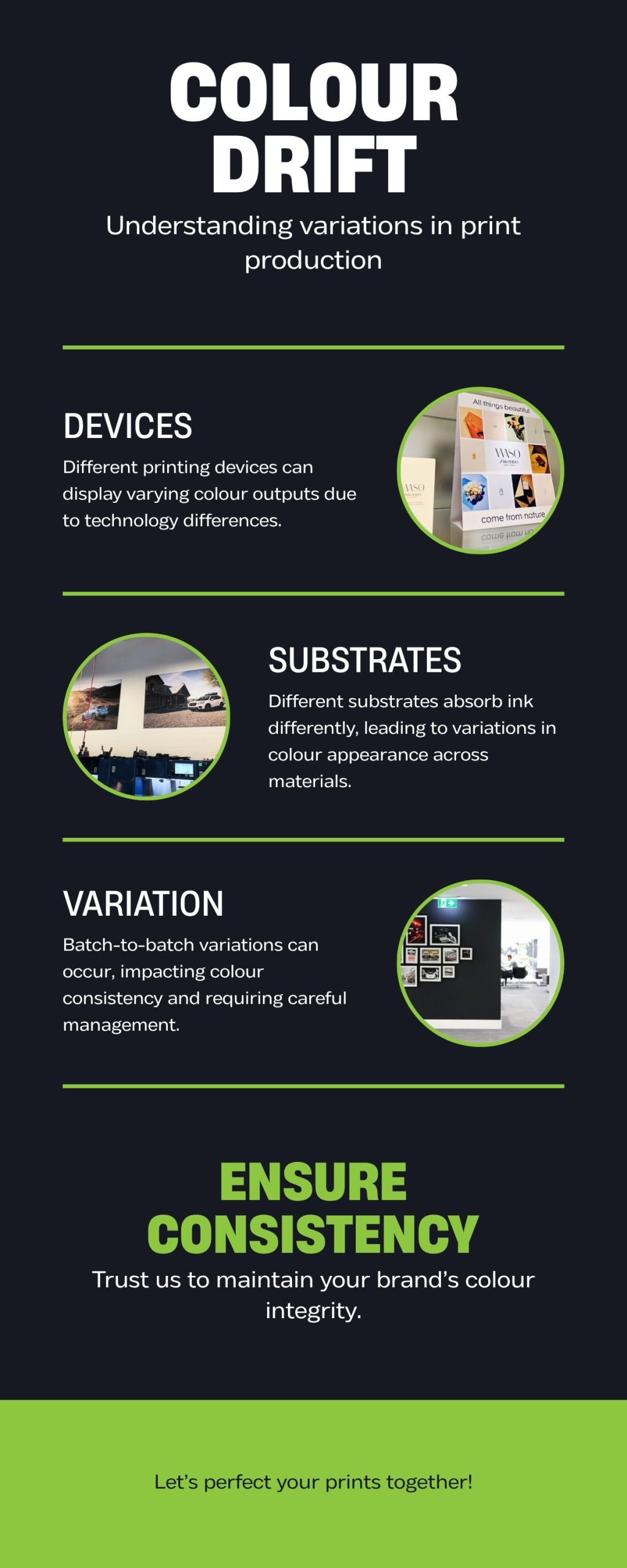
Because the same file never meets the same conditions twice. An offset press, a digital press, and a large format inkjet each build colour in a fundamentally different way, with different inks or toners on different equipment. Send one logo to all three without active colour management and you’ll get three interpretations of it, each technically “correct” by that machine’s defaults.
Start with the devices. Offset lithography transfers ink from a plate to a rubber blanket to the sheet (PrintWiki), using wet inks mixed for that run. A digital press skips plates entirely and images directly onto the substrate (Xerox), typically with toner. A large format machine sprays inkjet inks. Three chemistries, three ways of arriving at “green.”
Then the substrates. The same ink on coated stock, uncoated stock, vinyl, and fabric produces visibly different results, because each surface absorbs and reflects light differently. A colour that sits crisp on a gloss brochure can go soft and muted on banner material. That’s not a defect. It’s the material doing what materials do.
Then time. Ink batches vary slightly. Presses drift between calibrations. Humidity and temperature on the production floor shift how ink behaves. A shop that isn’t measuring and correcting will wander, job by job, away from your target without anyone noticing until a franchisee does.
Sometimes the drift starts in your own artwork: a logo saved as RGB in one file and CMYK in another will never match anywhere. We cover that failure mode in why print files fail. Want a professional eye on your brand files first? Book a complimentary consultation and bring all three greens.
What Does Pantone Colour Matching Actually Involve?
It means the shop treats your brand colour as a measurable target, not a suggestion. A colour-managed printer keeps your Pantone references and approved samples on file, calibrates its equipment against known standards, and proofs each job to your targets before production, so job twelve matches job one even if they’re months apart.
Here’s what that looks like in practice, in roughly the order it happens:
- Your targets get documented. Pantone references, brand guidelines, and physically approved samples from past jobs live with your account, not in one estimator’s memory.
- The right process gets chosen per job. On offset, colour-critical work can run actual spot inks mixed to the Pantone formula. Digital and large format simulate that colour through process inks, and a managed shop knows how each device renders your specific target.
- You see a proof before the run. For colour-critical work, that should be a hard proof: a physical sample you hold, not a PDF on a screen that’s lying to you in RGB.
- Someone owns the standard. When the operator, the proofing station, and the person who answers your call share a building, “close enough” has a human gatekeeper.
None of this is exotic. It’s just discipline, applied before the press starts instead of after the complaint arrives. And it’s the difference between explaining a colour standard to your team and explaining a colour failure to your director.
Why the Brochure Should Come From the Same Roof as the Banner
Because the most common cause of mismatched brand colour isn’t a bad printer. It’s three adequate printers who have never seen each other’s output. The card came from one vendor, the brochure from another, the banner from a sign company, and each one matched its own interpretation of your file. Nobody was wrong. Nobody was consistent either.
When sheet-fed and large format production share one building and one colour standard, that failure mode disappears. The person proofing your brochure can hold it against the banner panel coming off the wide format machine and judge them side by side, in the same light, before either ships. C17 Media runs digital and offset presses alongside large format printing in one 15,000 square foot facility in Richmond Hill for exactly this reason.
Does that cost more than scattering the work across whoever quoted lowest on each piece? Sometimes, on the invoice. But split vendors carry a hidden bill: the reprint when the banner embarrasses the brochure, and the credibility you spend explaining it. We broke down that arithmetic in the true cost of cheap printing.
How Do You Keep Colours Consistent Across Franchise Locations?
You stop letting every location solve print locally. The multi-location version of colour drift is the worst version, because it compounds: twenty locations, twenty local vendors, twenty greens, and one head office fielding the complaints. Centralizing brand-critical print with one colour-managed shop turns twenty variables into one controlled standard.
This matters more than most franchise operators expect, because customers are watching. In a FedEx Office survey, 68% of consumers said a business’s signage reflects the quality of its products or services, and 52% said they were less willing to enter a store with poorly made signs (FedEx Office/Ketchum, 2012). It’s a US study, but the instinct travels. A customer who notices your locations don’t match each other quietly downgrades what the brand promises them.
This is work we know from the inside. Country Style trusts C17 Media with campaign print across its national franchise network, including the “Good Things Come in 3’s” campaign, where the same creative had to land identically in every store that hung it. One shop, one standard, every location on brand at once, and one phone number when a franchisee needs a reprint. See the Country Style brand story for how a national program holds together.
When Brand Colour Is the Product
Some clients can tolerate a slightly warm green for one campaign. Others can’t tolerate it for one unit, because the colour is doing the selling. Premium packaging and luxury retail environments are where colour management stops being a nicety and becomes the entire job.

Shiseido Canada trusts us with premium packaging on 10mil synthetic stock: waterproof, tear-proof, soft-touch material where the finish and the colour are the customer’s first physical contact with the brand. On a piece like that, “close” is a rejection. See the Shiseido project for what that standard looks like in hand.
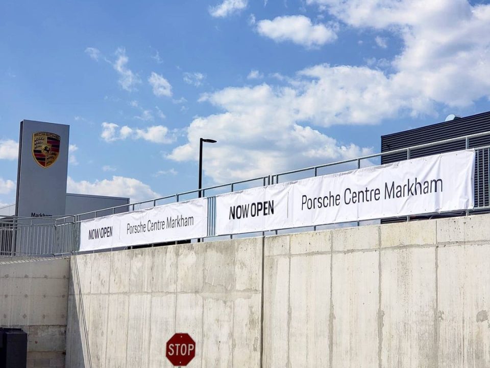
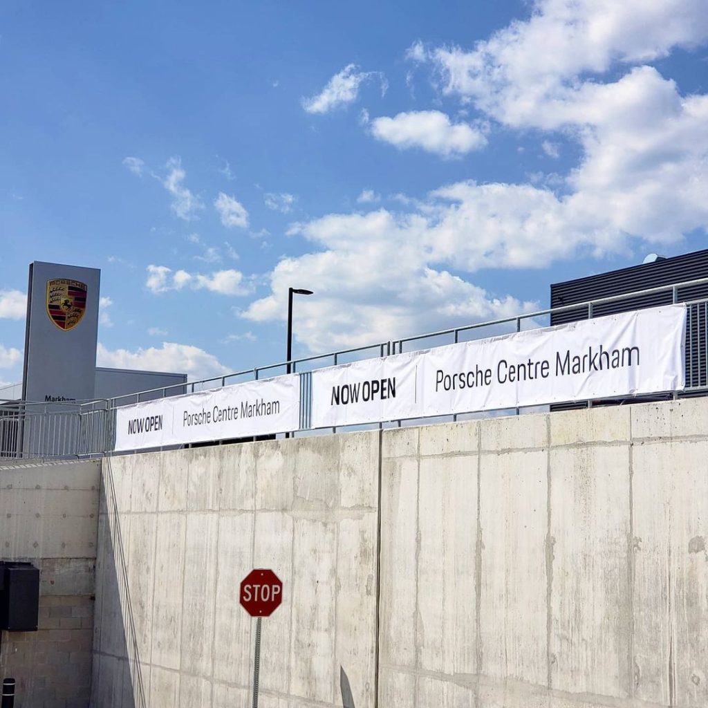
The same discipline carried the Porsche Centre Markham program, where we produced everything from showroom fabric displays to the opening-day stationery. A dealership’s brochure sits a few metres from its wall graphics, under showroom lighting engineered to flatter cars, and the two had better agree. The full project is on our portfolio, along with sixteen years of work for more than 40 recognized brands. We’re not asking you to take colour claims on faith. We’re asking you to look.
The Honest Limit: What “Consistent” Actually Means
Here’s the part a straight-shooting printer tells you upfront: a mathematically perfect match across every substrate isn’t achievable, and anyone promising it is selling. Physics gets a vote. Ink on uncoated paper will never behave identically to ink on gloss stock, vinyl, or fabric, because the surfaces themselves interact with light differently.
The real goal is controlled, intentional consistency. A colour-managed shop knows in advance how your green renders on each material you use, proofs each one against your brand target, and keeps every version inside a range where the eye reads them as the same brand. The franchisee stops asking which green is real, because every green on the counter is defensibly, deliberately yours. Uncontrolled drift is a surprise. Managed variation is a decision, and decisions are things you can stand behind in a meeting.
Frequently Asked Questions About Brand Colour Consistency
Why does my logo look different on paper than on vinyl or fabric?
Each substrate absorbs and reflects light differently, so identical ink reads differently on each surface. Coated paper holds colour crisp and saturated; uncoated stock softens it; vinyl and fabric shift it again. A colour-managed shop proofs your colour on the actual material, so the variation is controlled rather than accidental.
Can a printer match my Pantone colour exactly?
On offset, yes, in the most literal sense: a spot ink can be mixed to the Pantone formula and printed as itself. Digital and large format devices simulate the colour through their own ink sets instead. A managed shop tells you which approach your job needs before you commit, not after delivery.
What is a hard proof, and when should I insist on one?
A hard proof is a physical printed sample you approve before the full run. Screens display colour in RGB light, so a PDF proof can’t show you what ink on stock will do. For packaging, brand campaigns, and anything where colour is contractual, hold a hard proof first.
Will sending the same file to every printer keep my colours consistent?
No, and that’s the trap. The file is only one input. The device, ink system, substrate, and calibration state all shape the result, so identical files produce different colour at different shops. Consistency comes from one colour-managed workflow, not from the attachment you email.
How should a franchise manage print across many locations?
Centralize brand-critical print with one shop that documents your colour targets and produces to them for every location. Local vendors solve local convenience, but each adds its own interpretation of your brand. Country Style runs national campaign print through C17 Media for exactly that reason: one standard, everywhere.
What should I give my printer to protect my brand colours?
Your brand guidelines, the Pantone references for each brand colour, and, ideally, a physically approved sample from a past job you consider correct. Proper print-ready files matter too; our guide to why print files fail covers the file-side mistakes that sabotage colour before the press is even involved.
One Green, Everywhere It Appears
Brand colour consistency isn’t a printing feature. It’s a management decision: one documented target, one accountable team, proofs before production, and honest answers about what each material can do. Make that decision once and the Mississauga text message never gets sent.
C17 Media has managed colour for GTA and national brands since 2010, with digital, offset, and large format under one Richmond Hill roof and a 4.8-star Google average earned one job at a time. Send us the card, the brochure, and the banner photo that don’t match, and we’ll show you what your green should be doing. A complimentary consultation is a contact form away, or skip the form: 905-597-2178 reaches a person Monday to Friday, 9:00 to 5:30, and hello@c17media.com reaches the same team, who can answer the colour question on the spot.